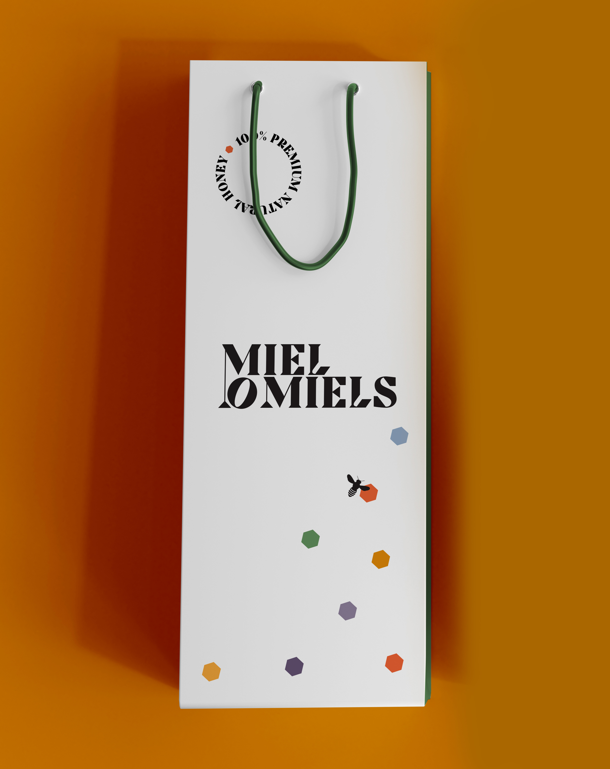
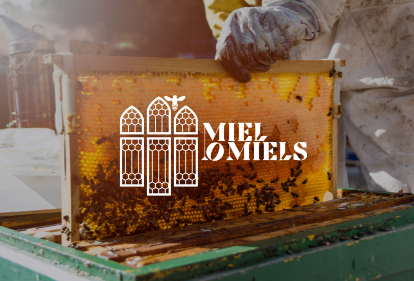
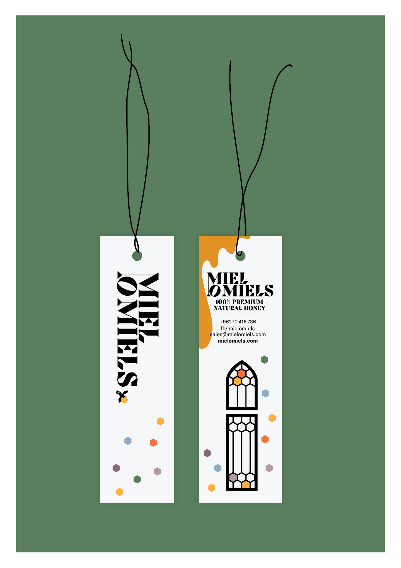
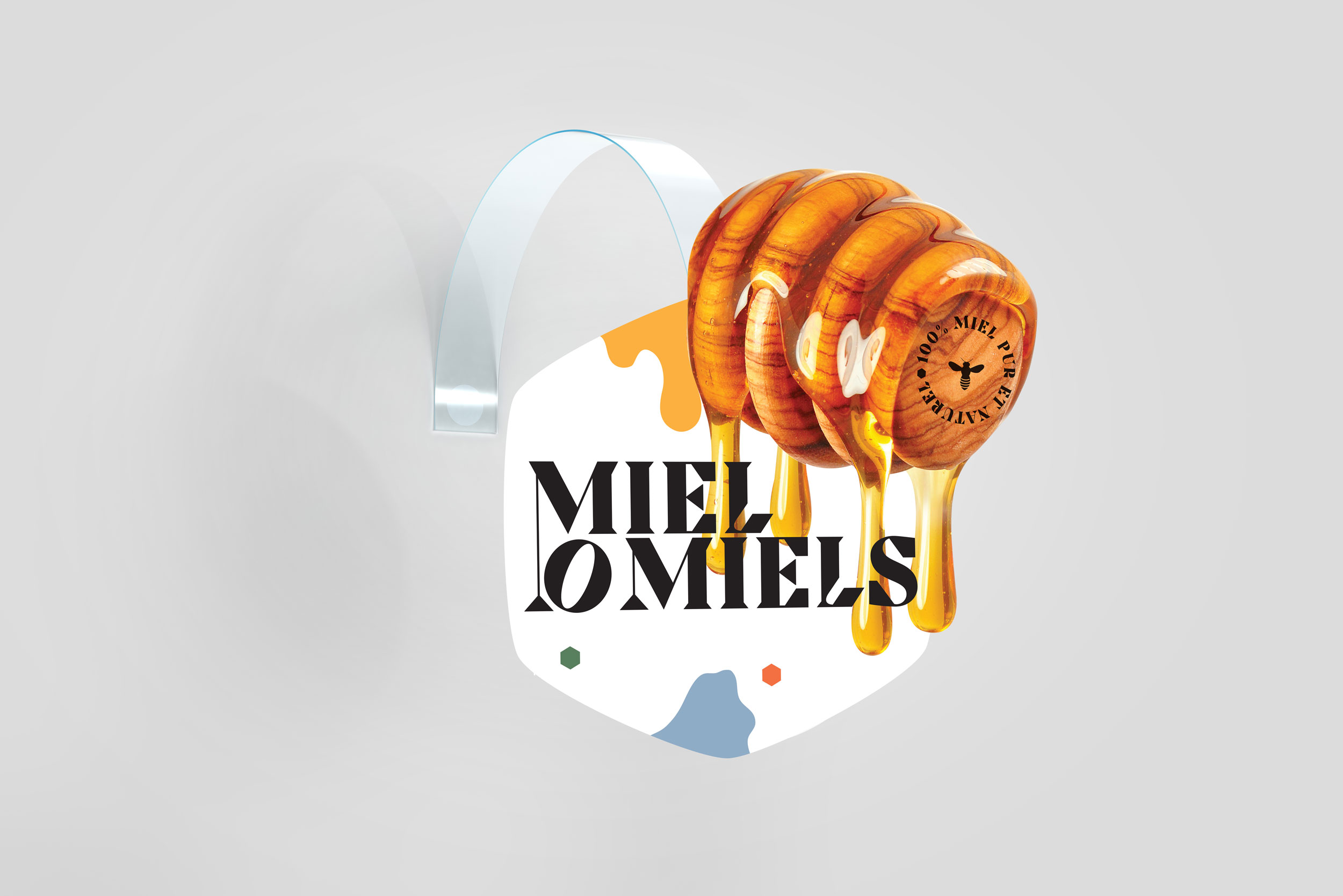
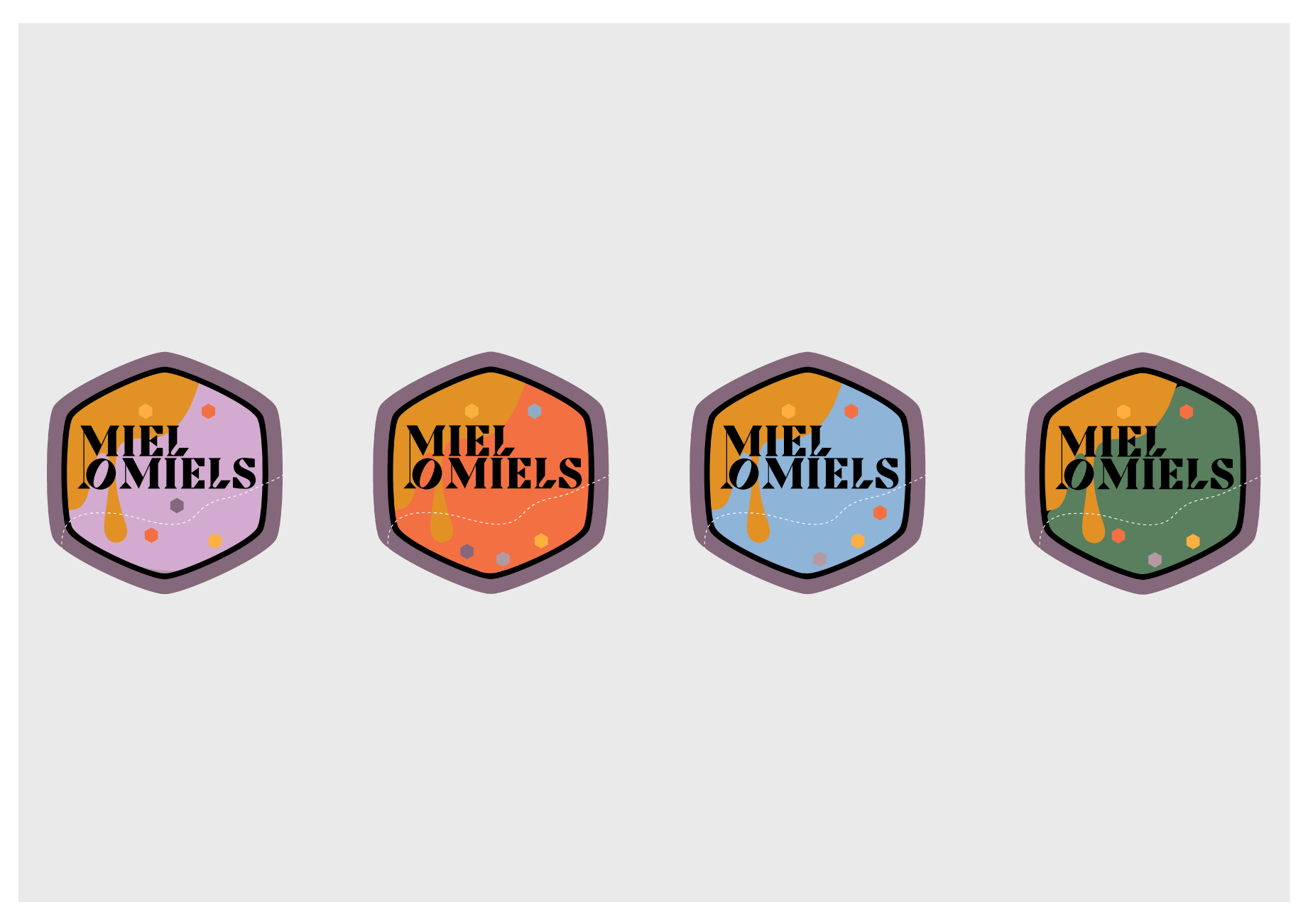
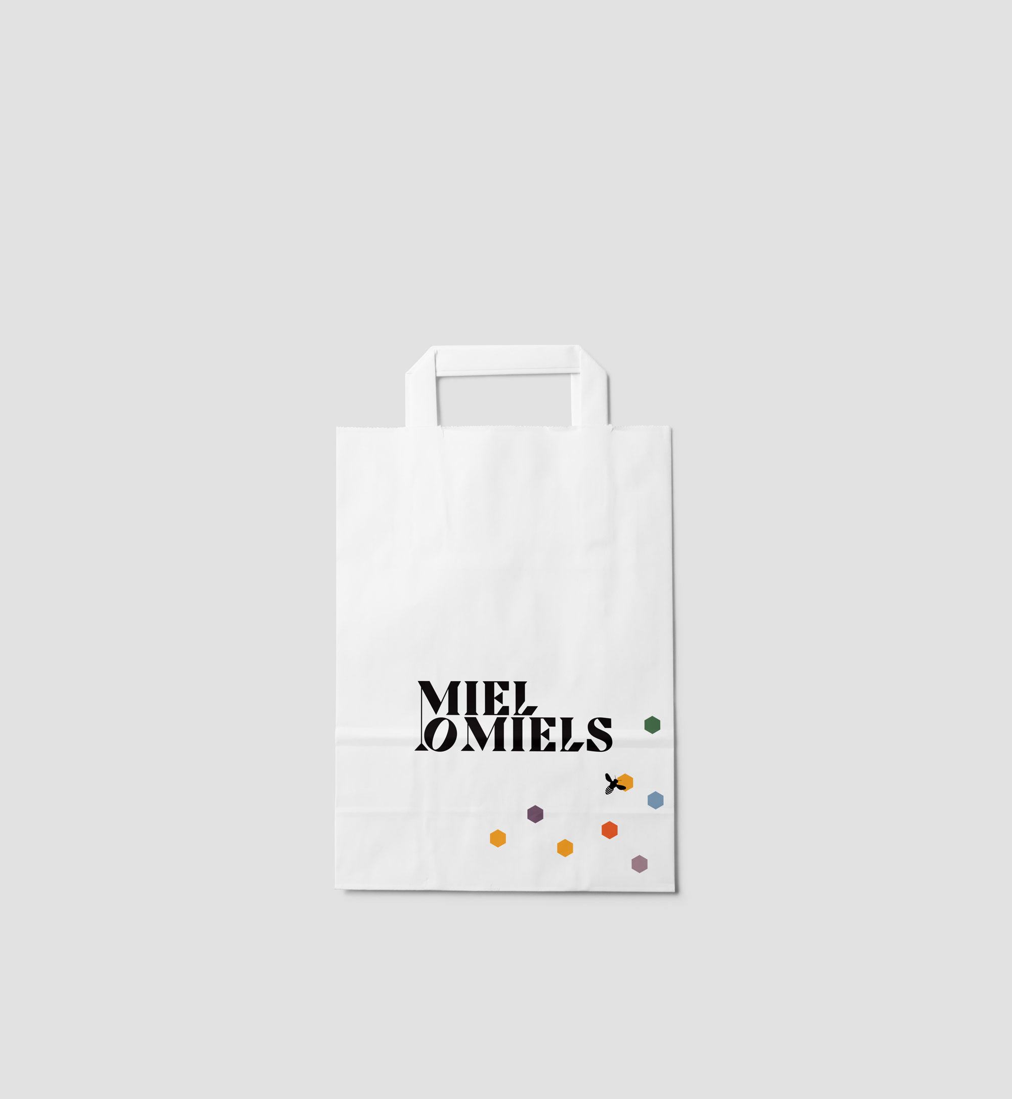
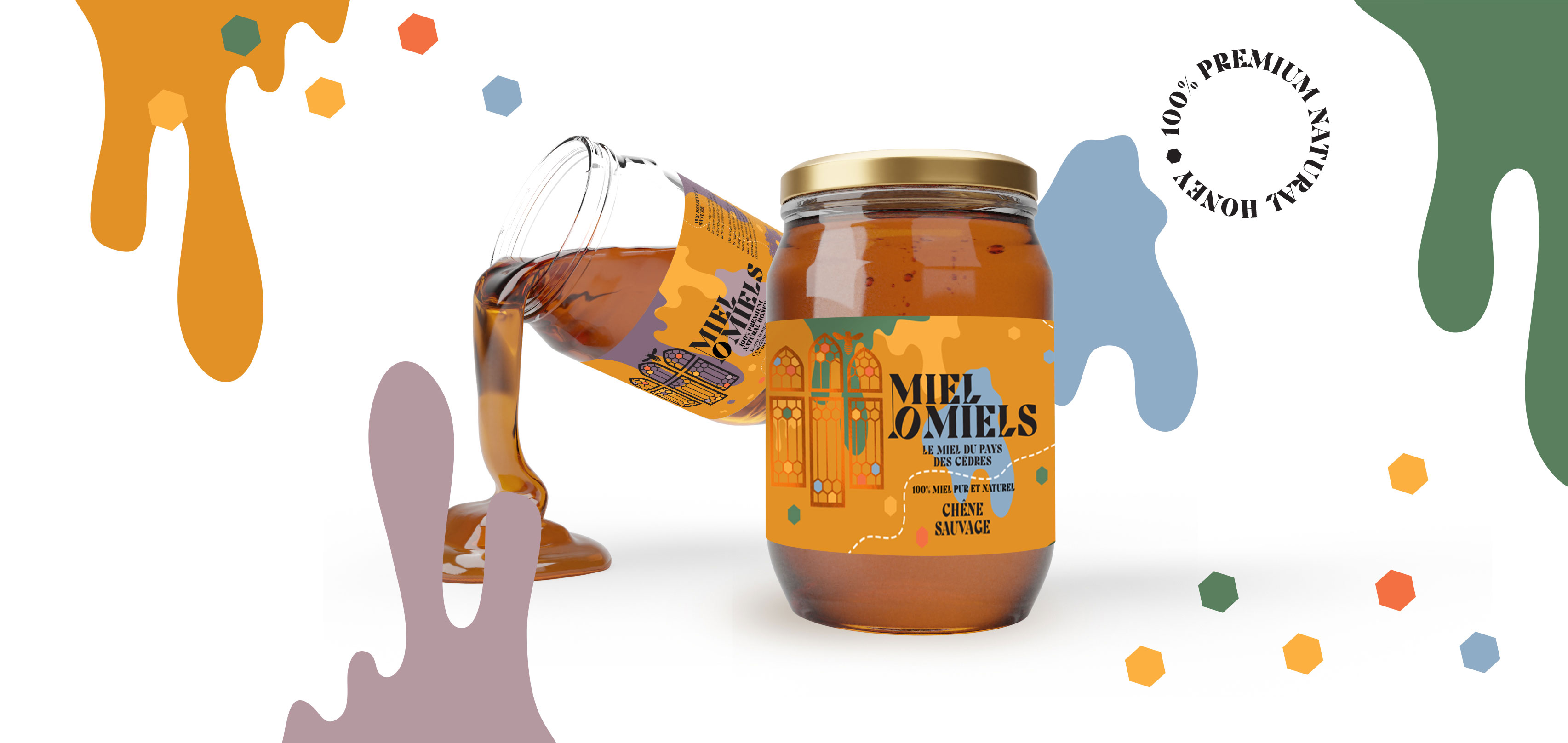
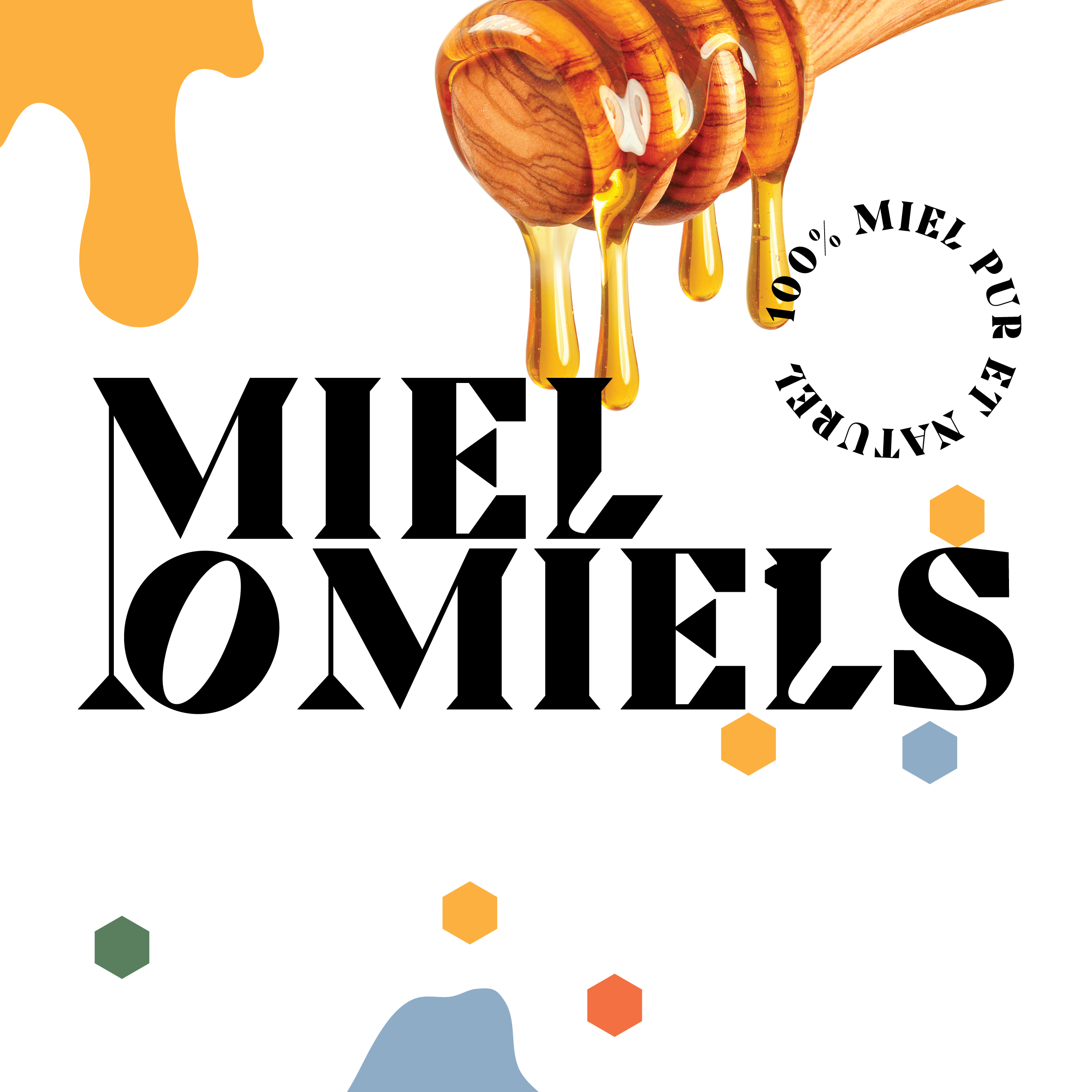
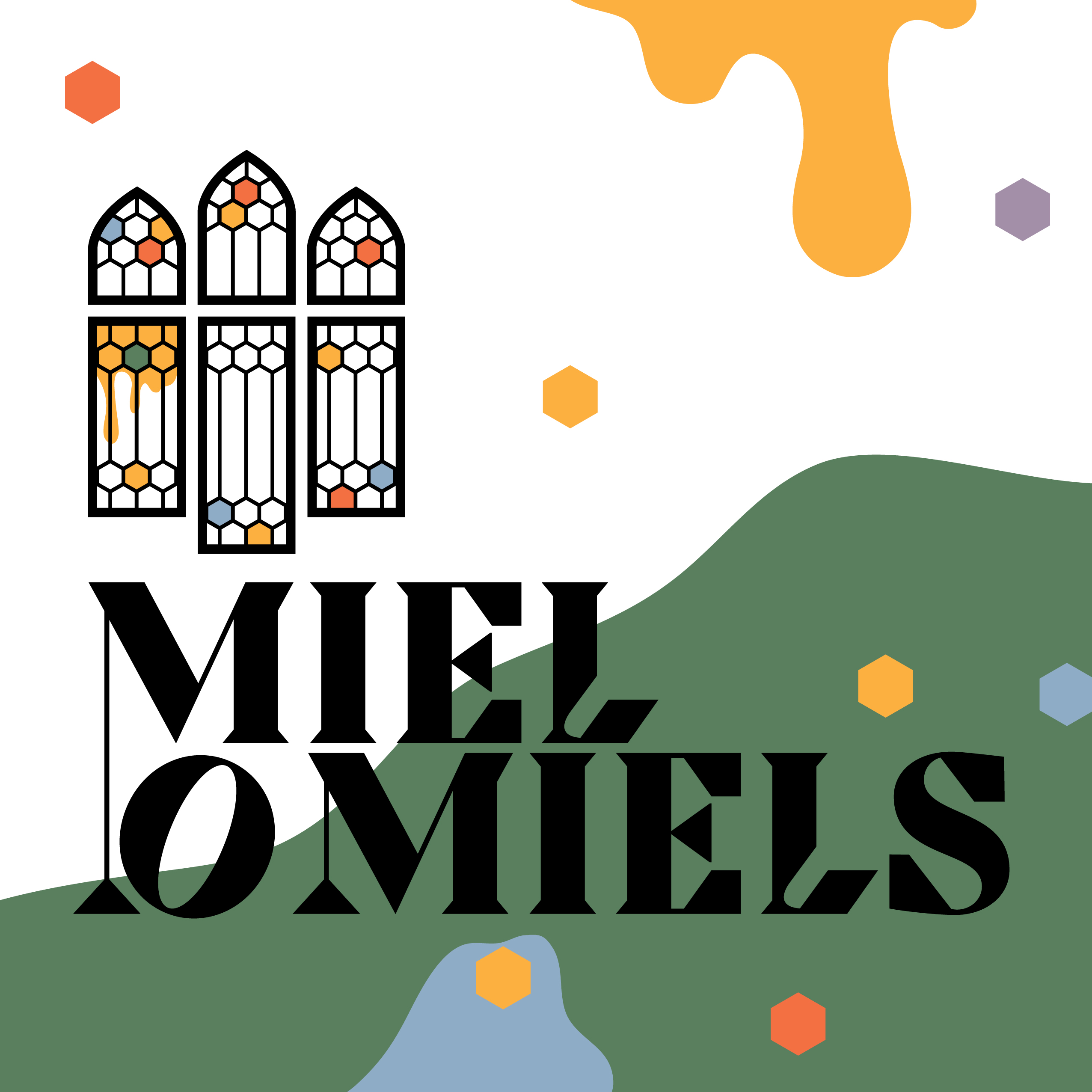
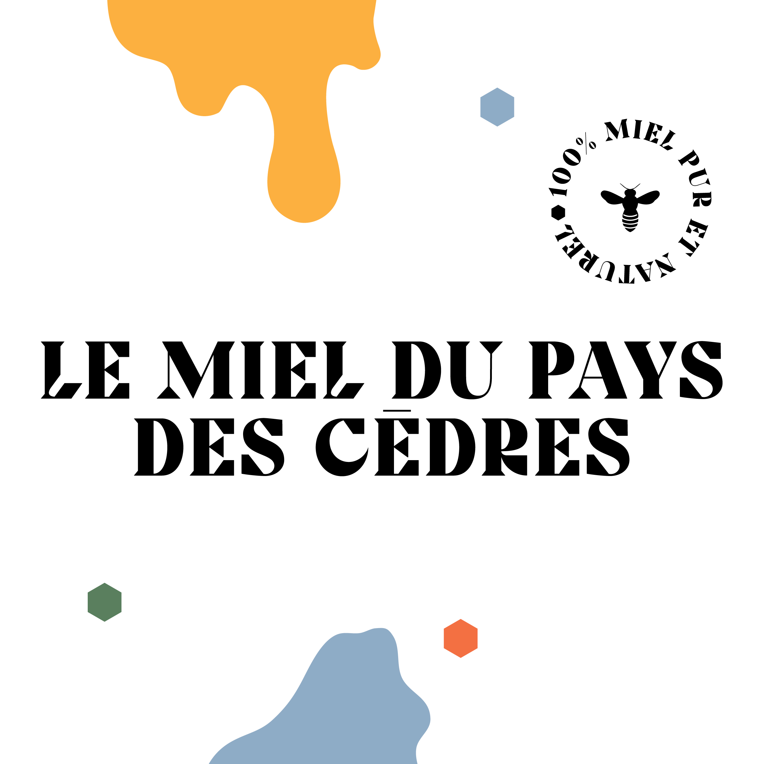
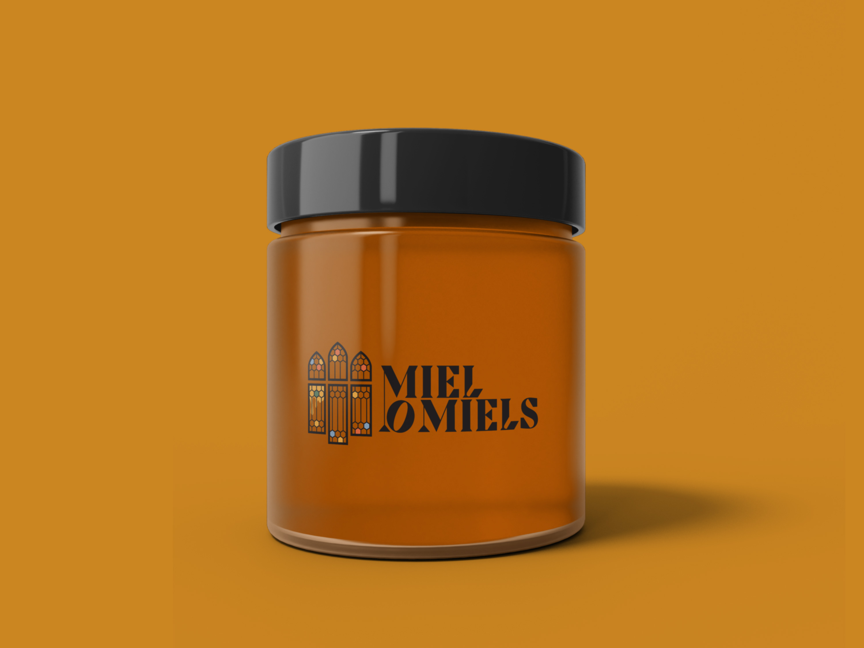
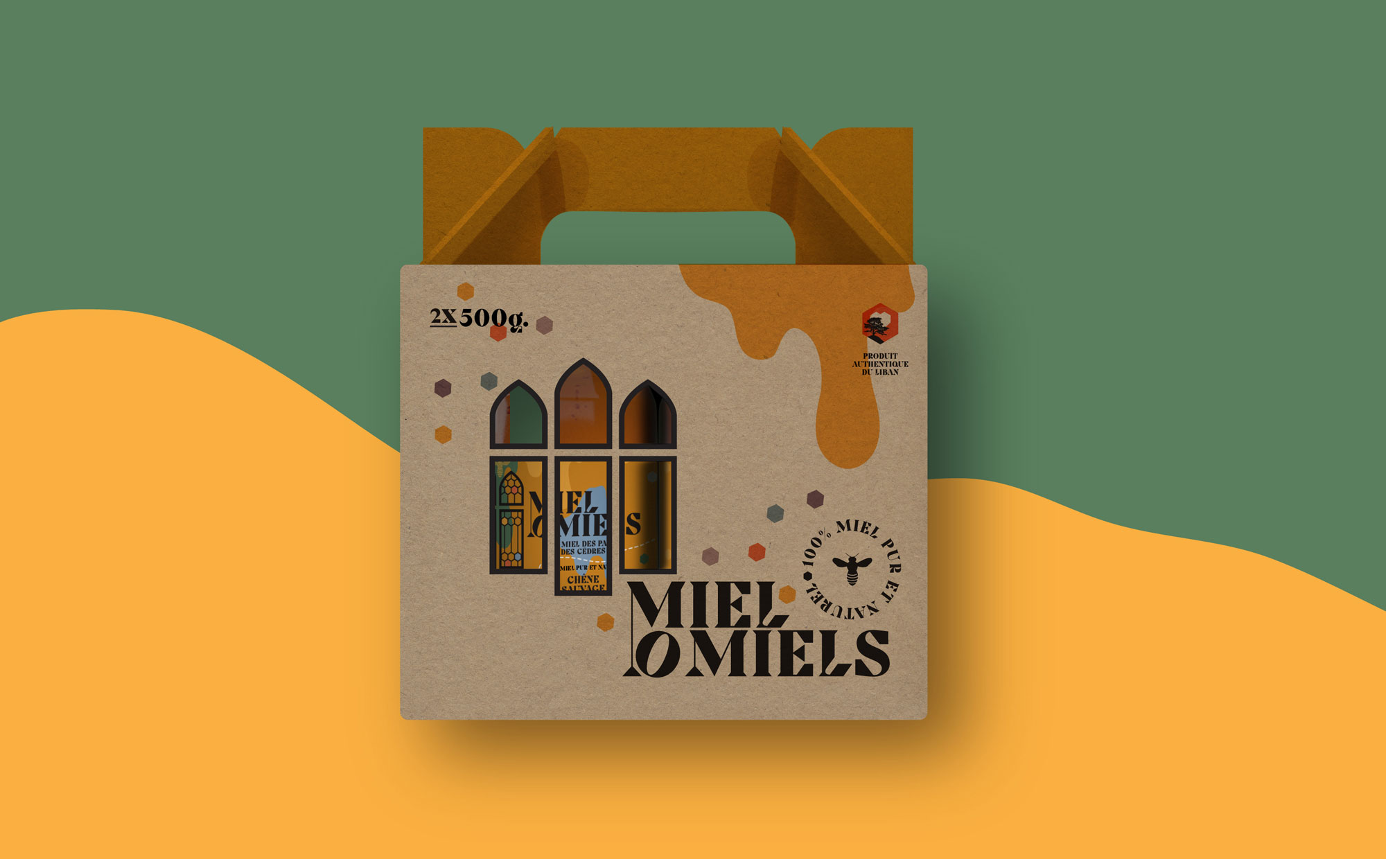
Miel O Miels was an existing brand of honey that was about to start exporting and needed a fresh new look. We started with a logo revamp, followed by storytelling and a stronger brand identity.
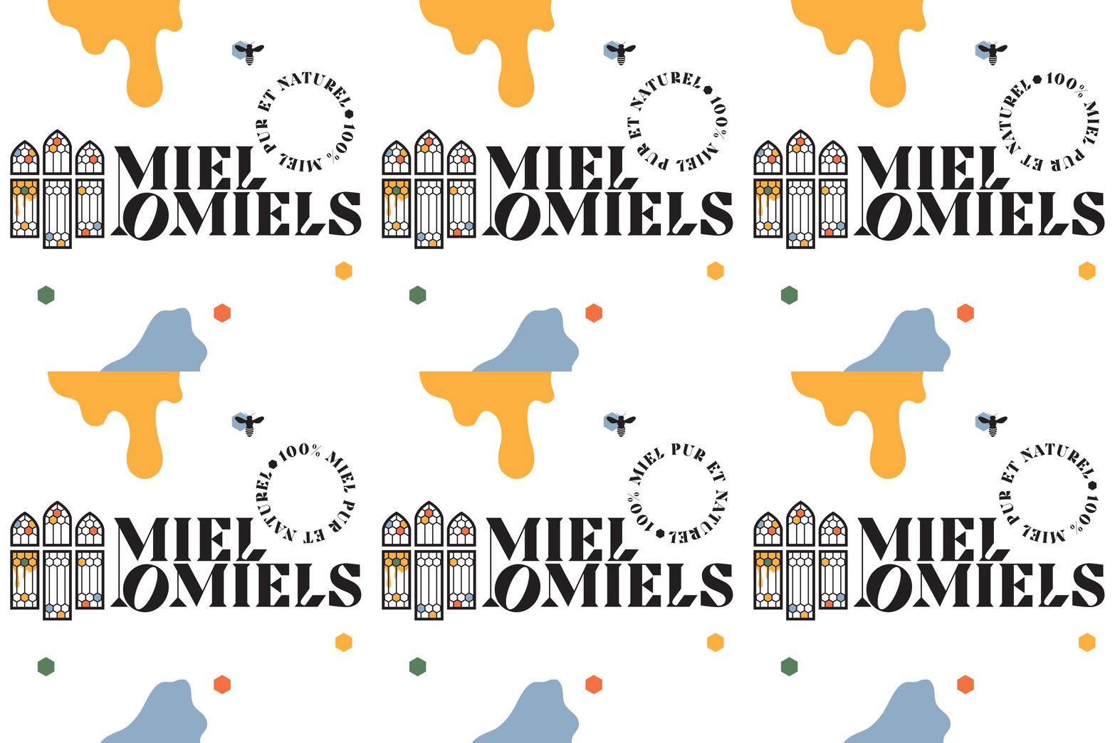
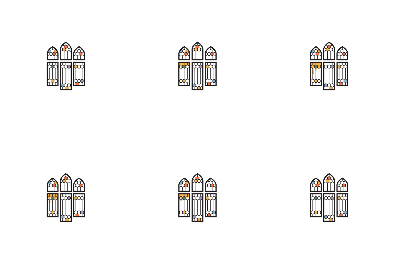
As we were discussing the project with the client, we could sense his strong love for Lebanon and its heritage, so we fused modern minimalism with the detailed beauty of traditional Lebanese architecture. We used the famous Lebanese windows with the honey comb pattern as building blocks for the logo.
