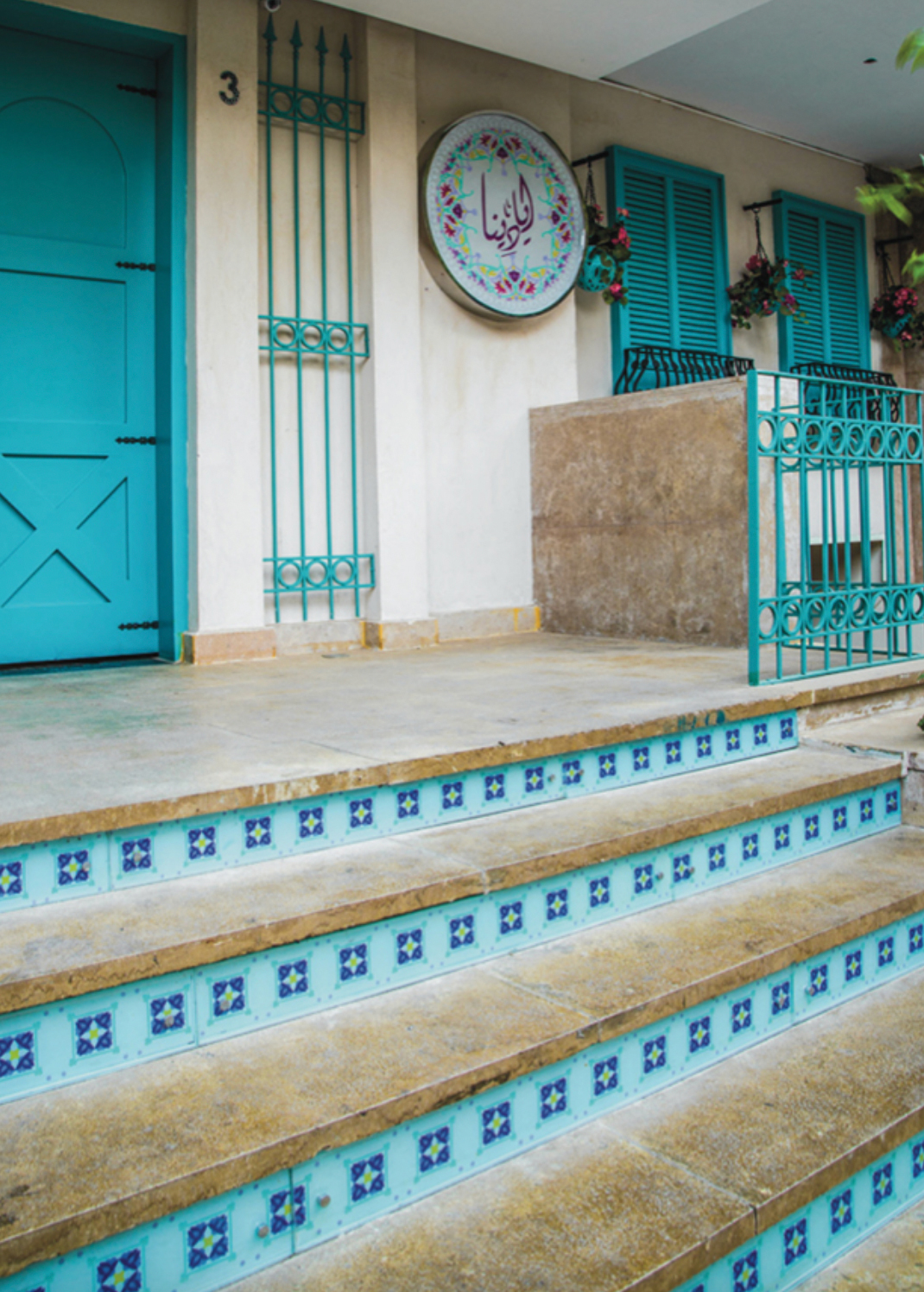
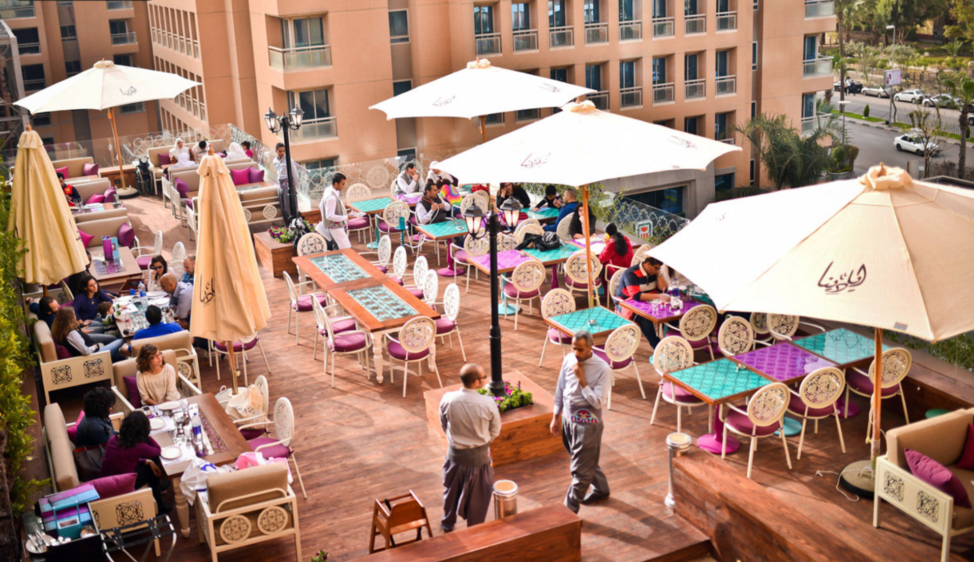
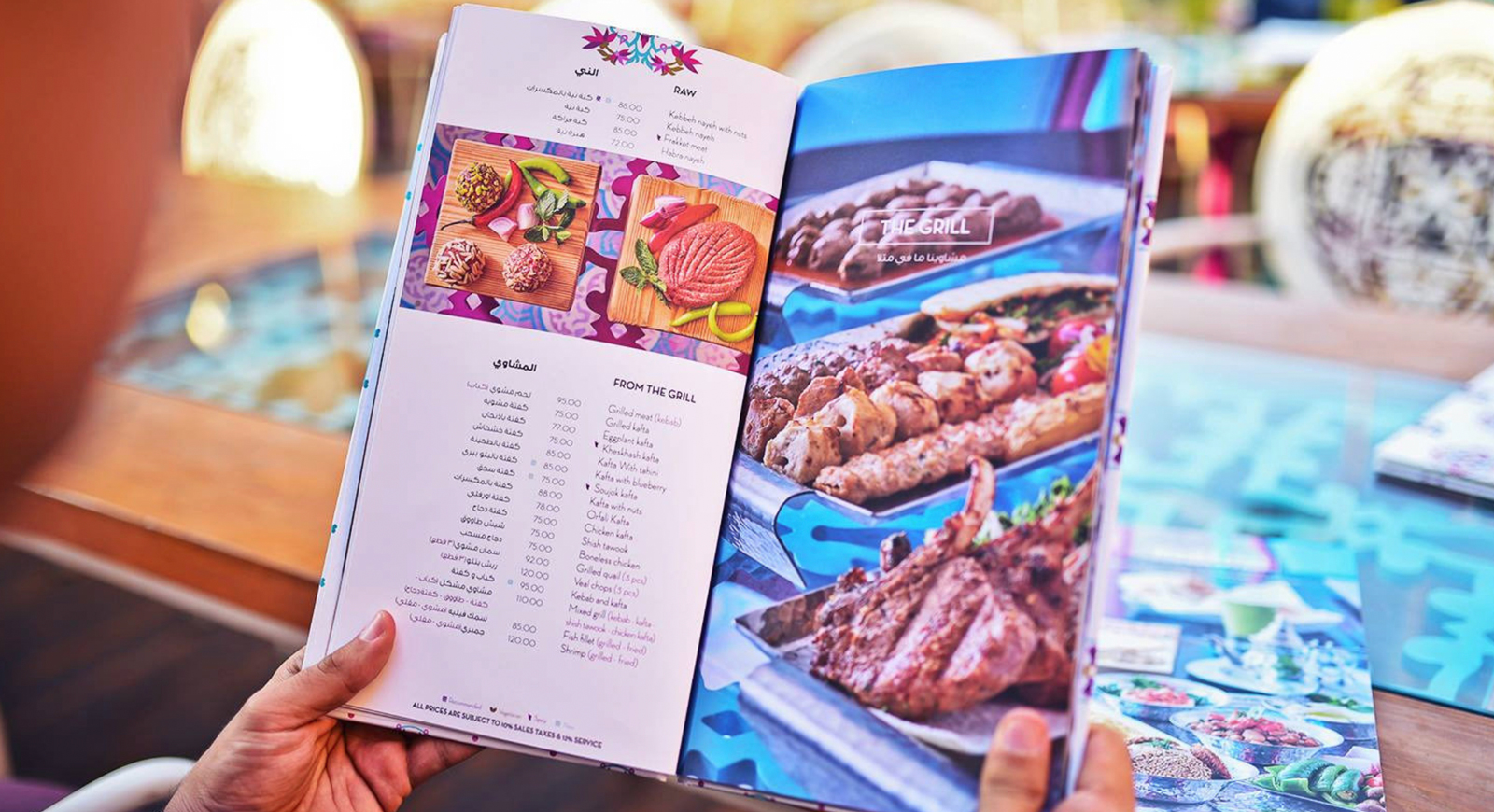
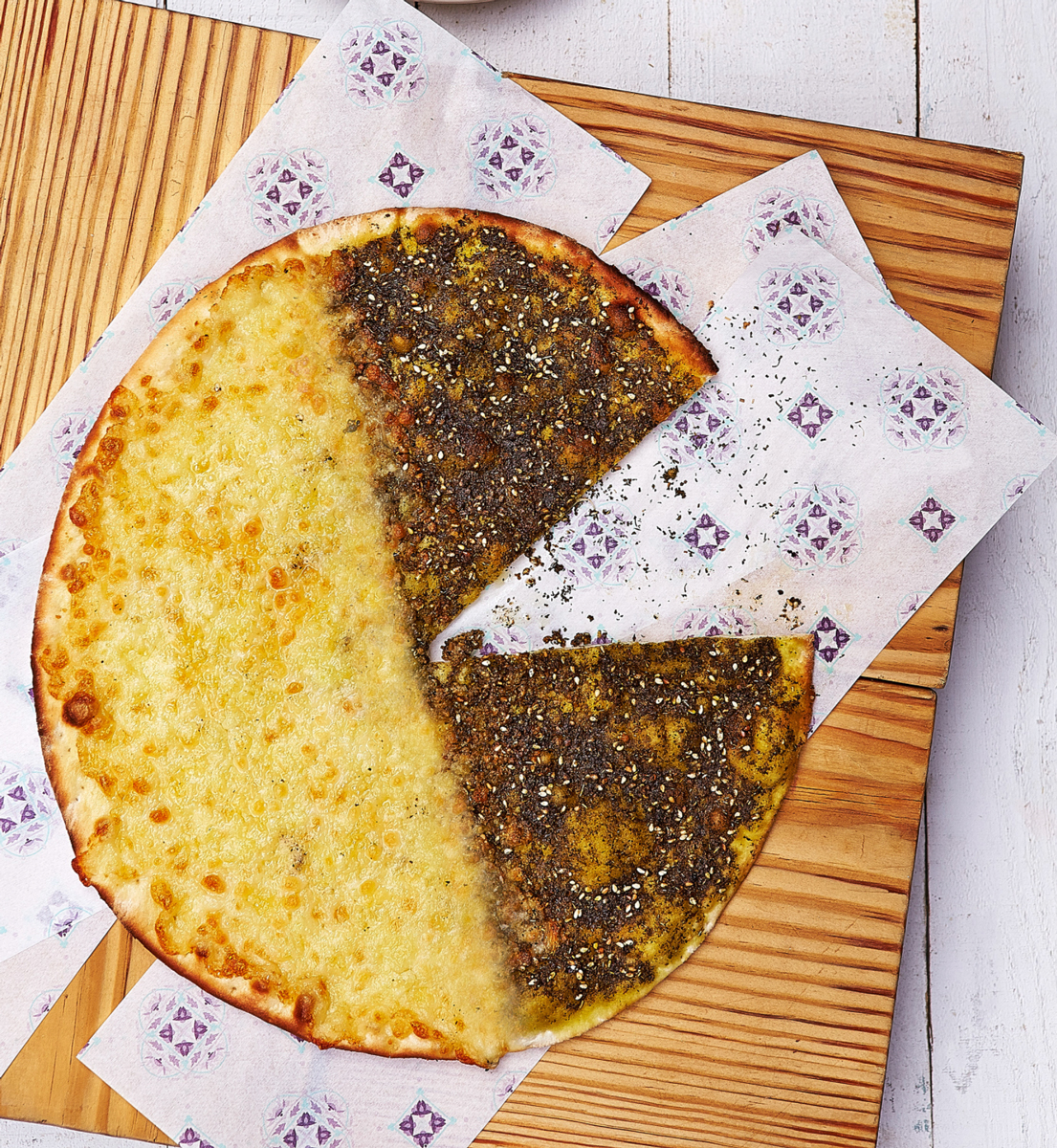
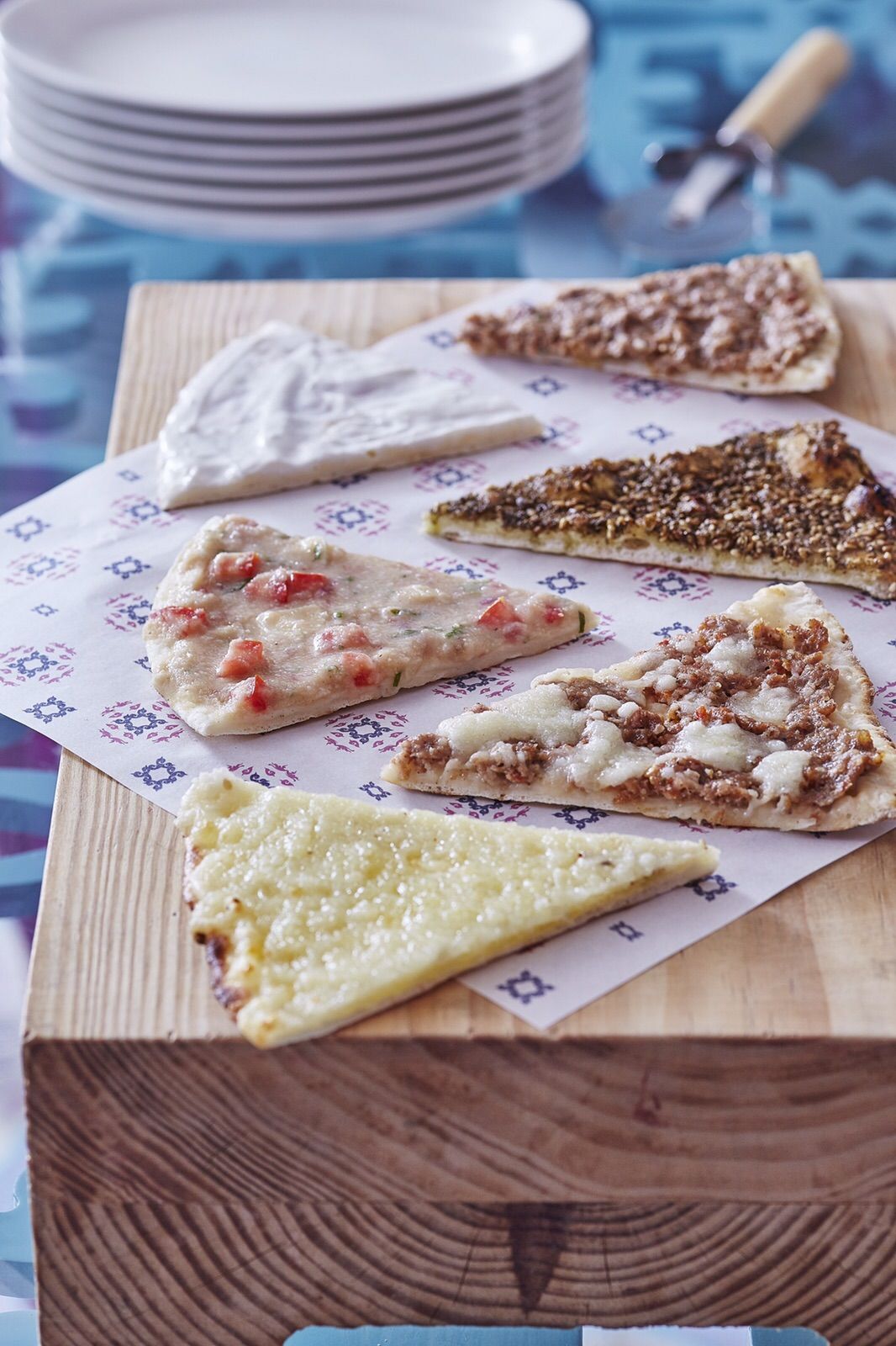
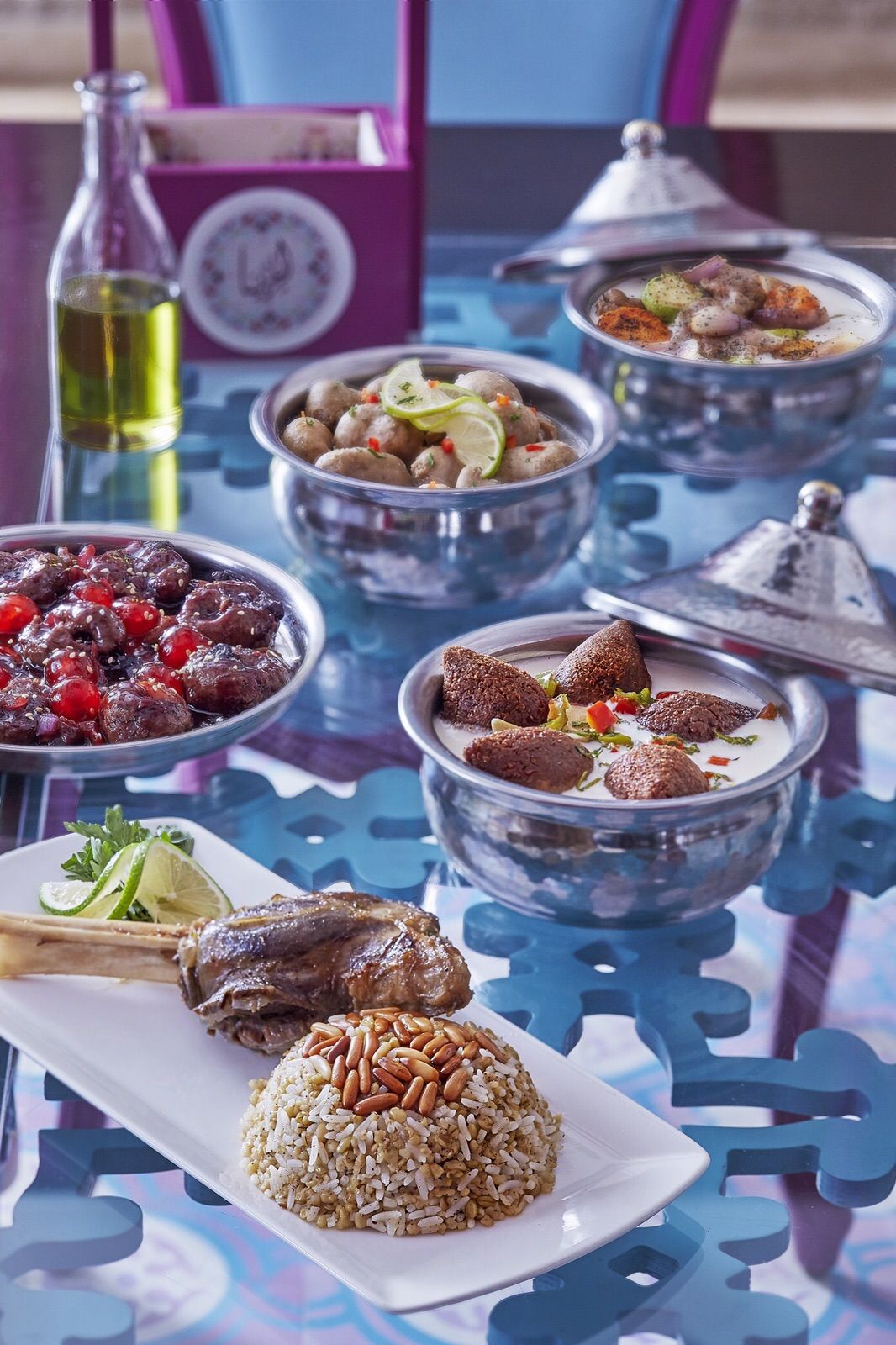
With an excellent Lebanese cuisine, the client wanted a modern, unexpected look for their launch. The brief was that the Lebanese flavor is to show in the dish and not necessarily in the branding.
The main challenge was creating something trendy, oriental, but most importantly that is not a cliché, with Arabic typography for the name. This is when it was decided to make the motif meet the color palette, a match made in design heaven was the result.
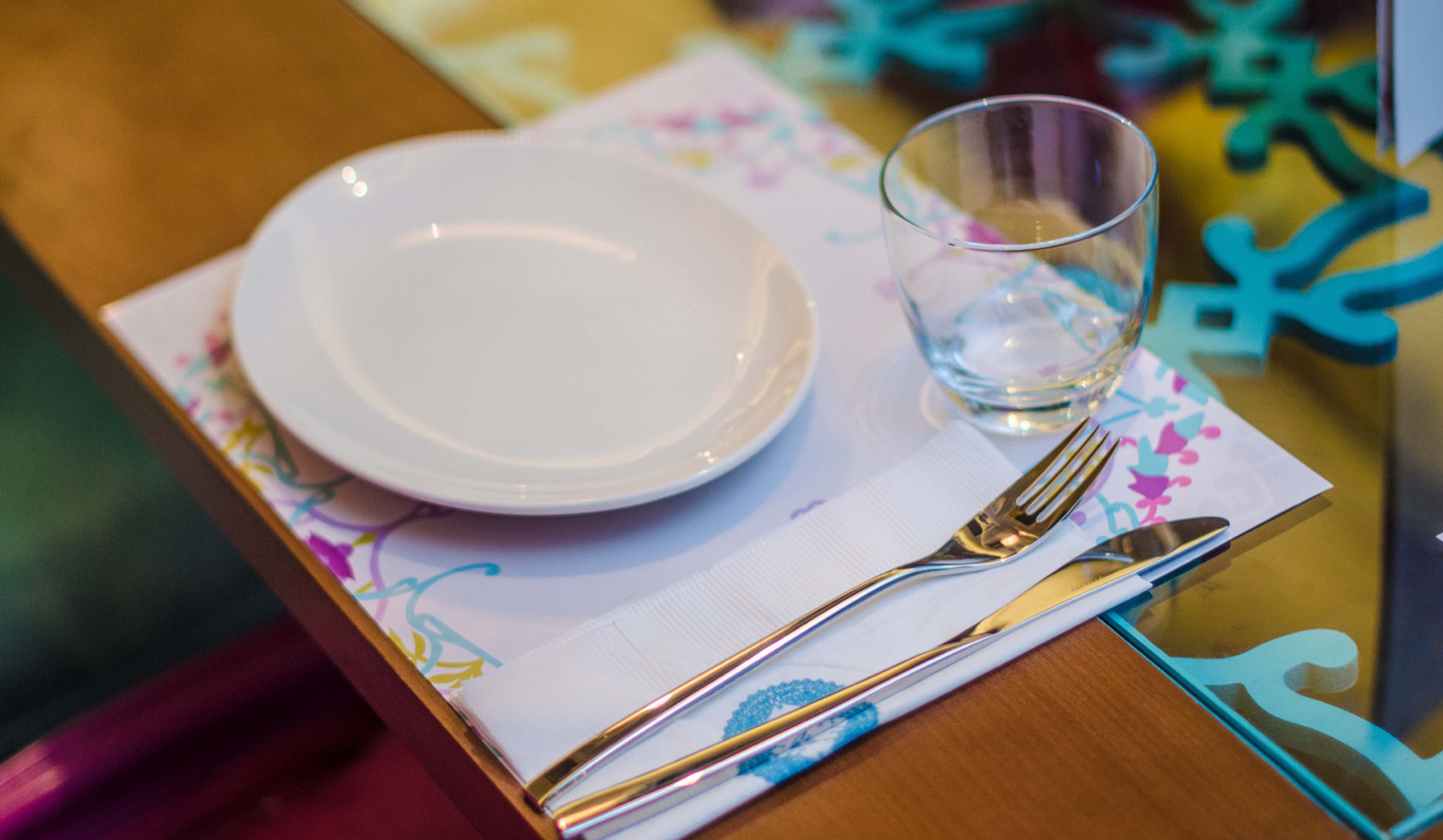
The application of the restaurant collaterals covered everything, the floor tiles, trays, sugar, salt, pepper and straw packaging, cups, coasters, place-mats and even valet keychain numbering.
The opening of Ayadina was a great success and reviews came in extremely positive and even more rewarding, the opening of several branches afterwards
